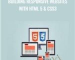
In this hands-on training course, award-winning veteran trainer Geoff Blake shows you, step-by-step, how to build beautifully designed, responsive websites that adjust and function perfectly on smartphones, tablets, and desktop displays. You’ll begin with the fundamentals of responsive design, beginning with multiple style sheets, media queries and various expressions. Next comes the fun part: you’ll be guided through several in-depth chapters that walk you through the responsive design workflow, building HTML structure and CSS formatting for mobile and desktop displays; including tablets, desktop screens, and smartphones. Geoff shows you how to plan out your work, handle common issues that arise in a responsive layout, and how to handle various page components between device displays. Finally, the course closes with additional tricks, advanced techniques, and testing methods to ensure that your layout looks fantastic.Course CurriculumIntroductionWelcome (0:48)A Look At What We’ll Build (1:36)Responsive Design FundamentalsKey Aspects Of Responsive Design (2:43)Determining Device Resolutions To Target (4:20)Wireframing Responsive Layouts (4:58)The Basics: Multiple Style Sheets & Media QueriesThe Concept Of Using Multiple CSS Files (10:51)Media Queries & Multiple Style Sheets (8:59)Building Media Queries Into A Single CSS File (7:40)Using Media Query Expressions (5:06)Building HTML Structure & CSS For All ScreensSetting Up The HTML & CSS Files (4:21)Getting Started With The Header (7:36)Inserting The Main Nav Menu (6:03)Inserting The Search Field (6:57)Problems With Applying Floats (4:21)Integrating Google Fonts API (3:26)Building The Hero Section Structure (4:27)Formatting The Hero Section (9:06)Inserting & Formatting A Call To Action Button (9:53)Building The Features Section, Part One (5:48)Building The Features Section, Part Two (4:58)Inserting The Organize Section (8:20)Building The Share Section (5:17)Building The Call To Action Area (6:38)Inserting And Formatting The Footer (3:48)Finishing Touches For The High Resolution Layout (4:08)Building The Tablet LayoutSetting Up The Medium Resolution CSS & Testing The Media Query (7:03)Formatting The Medium Res Header (4:10)Formatting The Medium Res Hero Section (6:10)Formatting The Features Section (2:14)Formatting The Organize And Share Sections (5:19)Building The Get Section & Finishing Up The Medium Res Layout (2:54)Building The Smartphone LayoutSetting Up The Low Res CSS & Testing The Media Query (4:42)Formatting The Low Res Header (2:53)Resolving Problems Caused By Floats (4:23)Formatting The Low Res Hero Section (3:18)Formatting The Features Section (1:46)Formatting The Organize And Share Sections (2:59)Building The Get Section & Finishing Up The Low Res Layout (3:07)Advanced Techniques For Responsive DesignDisabling Device Smart Zoom (6:01)Testing Your Responsive Layouts (4:29)Setting Up Retina Display Graphics (6:23)Wrapping UpWhere To Go From Here (2:50)Get Building Responsive Websites with HTML 5 & CSS3 – Anonymous , Only Price $20Tag: Building Responsive Websites with HTML 5 & CSS3 Review. Building Responsive Websites with HTML 5 & CSS3 download. Building Responsive Websites with HTML 5 & CSS3 discount.

 ICT – Mitch Genser & Christina DuBois-Nugent + Workbooks – Optionetics
 Harmonica School – Tomlin Leckie
₹7,138.00
Harmonica School – Tomlin Leckie
₹7,138.00
Building Responsive Websites with HTML 5 & CSS3
₹2,656.00
Building Responsive Websites with HTML 5 & CSS3
₹2,656.00